
Cell phones have become a must-see for companies seeking greater reach and visibility of their business on digital platforms. And no wonder, if you take into account the potential of this market which alone in 2018 sold more than 1,400 million smartphones worldwide. That is why mobile web design is no longer just a trend, but a strategic step that must be taken to reach a wider audience.
In tune with that reality, Google began testing in 2016 to change its indexing system from desktop to mobile version. After a year and a half of evaluations, the company confirmed in 2018 the complete launch of the Mobile First Index. This is an index with which it gives priority to mobile results in its indexing and classification.
Through this new model, the technological giant will mainly track the pages with the mobile version and index them. But what specifically changed? Here we share this model that Google developed so that companies know the impact that this model will have on their sites. Analyze what is your case and how to make improvements on your site!
The importance of AMP mobile web design and Responsive Design
In addition to the relevance that Google gives to the mobile versions in the search results, at the beginning of 2018, the company also announced that the “loading speed” of the pages would be taken into account in its relevance index, since be it for mobile or desktop versions. This adjustment will not be a problem for sites that are already optimized, however, for those who have not yet done so, Google also has the AMP (Accelerated Mobile Pages) platform that will allow this strategic step to be taken. So if you have not done it yet, get down to the task!
The purpose of AMP mobile web design is to optimize the loading time of sites to mobile devices quickly, by prioritizing content. This would be a good option for your mobile version, thanks to the different benefits it offers, such as improvements in UX design and SEO positioning; increase in user traffic; simplicity of creation and better location in Google search results.
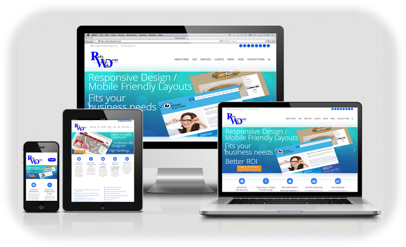
But the matter does not get there. The ease of adaptation of a desktop to a mobile website is also key to its positioning. Not only because Google also rewards it, but because users take into account factors such as the good visualization of the information and the experience offered by the page.
Additionally, developing a responsive design has advantages such as flexibility; it is easy to manage, improves UX and speed; there is a better construction of the links, among others.
Important: keep in mind that although these two factors are key to the optimization and positioning of your page, they are not the same, because “responsive web design is based on creating an adaptive web design for computers, mobile devices and tablets, therefore, they are more focused on the flexibility of the content. The AMP mobile web design is designed to deliver content instantly to mobile teams, focusing on speed and the best user experience. “

The power to reach more readers through Instant Articles
Facebook has also developed a tool that makes it easier for users to read informative content while benefiting companies that want to position themselves on this platform and gain visits (without the need to go directly to external links, but from the same platform).
This is the Instant Articles, a new feature that Facebook launched in mid-2015 and that allows users to quickly consume information, not only articles, but other formats such as photo carousels.

So that people can identify the contents made and available with this new format, the publications are labeled with an icon in the form of lightning. “When the user clicks on them, it goes directly to the content of the article or post in question, without having to be redirected to any other place. In addition, they have a fairly simple and intuitive interface, which allows easy and quick reading on any device, “explains the portal NeoAttack.
The Instant Articles are based on designs AMP to prioritize information and facilitate loading times. In addition, they have features such as the development of a friendly interface; they facilitate the possibility of sharing the contents; reduces the possibility of advertising links, among others.
If you are taking the first steps for the development of your website, do not advance further if you have not taken into account the mobile web design.