Google announced that it had received more searches from mobile devices than from desktop for the first time. As a result, the online industry has put a greater interest in the development of new concepts and strategies of mobile web design. In this way, the Mobile First methodology has revolutionized the creation of pages by focusing first on the design of mobile terminals – also thinking about their usability and performance – and then adapting them to the screen of a computer.
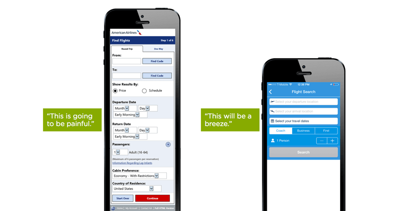
Thinking about mobile web design, rather than traditional

Mobile First is a web design concept optimized for mobile, where initially a web page is created for tablets and smart phones, to adapt it later to the needs of a desktop browser. Until a few years ago, it was common for designers and programmers to take over the execution of web pages designed only to be viewed on computers. In principle, these were designed with a variety of features, adapting their graphics and structure to be displayed on large screens, using high-speed data connections. Thus, the planning of a mobile web, which until then was considered a kind of appendix, would be relegated to the background. With Mobile First, the workflow is reversed and other priorities are set;
The Mobile First principle

Mobile First is a web design concept optimized for mobile, where initially a web page is created for tablets and smart phones, to adapt it later to the needs of a desktop browser. Until a few years ago, it was common for designers and programmers to take over the execution of web pages designed only to be viewed on computers. In principle, these were designed with a variety of features, adapting their graphics and structure to be displayed on large screens, using high-speed data connections. Thus, the planning of a mobile web, which until then was considered a kind of appendix, would be relegated to the background. With Mobile First, the workflow is reversed and other priorities are set;
A quick look at mobile web design
- It concentrates on the essentials
- Does not invest more effort in programming than necessary
- Designed for maximum performance on all devices
- Your information is quick access
- It has personalized designs designed for smart phones
- Avoid the use of large images and unnecessary features
- Includes reductions in the source code
- The web is programmed directly in HTML 5, thus renouncing JavaScript
In principle, the purpose of the Mobile First design is to develop an optimal web solution for mobile devices; and only later, based on the progressive improvement strategy these web pages are optimized for all types of computer screens and laptops. The next step is to adapt the website to formats large enough to be displayed on large screens. It is common that, during the implementation of this strategy, grids are created in mobile format. Finally, it is worth mentioning that every web optimization process based on the Mobile First strategy is guided by the principles of responsive web design.
Why opt for Mobile First?

The large number of visits to web pages from mobile devices proves that, for some time, web design for smart phones and tablets has not only become a niche, but has become a main market that should be a priority for any online project. Experts estimate that by 2021, with almost 49 Exabyte’s, global mobile data traffic will increase five fold.
Obviously, the traditional web design for computers and laptops should not be left out, but whoever wants their business to reach a greater number of potential customers, and therefore generate more traffic to their website, should concentrate on the development of a mobile web design strategy. Starting to work using the Mobile First strategy will not represent a technical setback at any time. Thanks to its simple structure, limited to the essential, it is possible to adapt it and add new features once it has been completed.
In addition, the work of the designers is facilitated, since they will be allowed to use CS predecessors to modify, easily and without complications, parameters such as colors or fonts without having to use mandatory CS code.
Convert apparent weaknesses into benefits
The greatest benefit of the Mobile First strategy: when a supposed weakness becomes an advantage. Of course, a small screen represents a smaller display area and even some format restrictions; but instead of considering it as a cause of content loss, it should be considered as a factor that reduces information and irrelevant functions, which allows creating a practical web page, easy to use and with the really necessary content. Thus, as the editor of a web page, it is possible to adapt to changes in the behavior of users and lay the foundations for the successful development of a Mobile First strategy. Remember, it is not only about aspects related to the design of a website, but a process of creating a comprehensive website.
New usability criteria
Regardless of the size of the screen, for web designers the design of a web page for mobile devices involves a challenge with different challenges than traditional desktop screens. They are, for example, the demands of users and the new principles of usability of a page. A few months ago, with the latest Mobile Update, Google modified its search algorithm focusing on improving web usability on mobile devices. The key factors are, of course, the local context of use; such as searching opening hours of a restaurant or directions to get somewhere. Well, even with identical queries, the search engine results page changes depending on whether it is done from a smartphone or from a laptop. In addition, the operating system of mobile devices also plays an important role in Se Rps.
What is mobile friendly?
To check if a web page is considered as friendly, that is, to know if it has a design optimized for mobile, just enter the url in the tool Google Webmaster Tools. Google will make an evaluation of those factors that we will state below.
A web page is mobile friendly when:
- You can access your content easily
- The content is responsive and easy to read
- It has short loading times
- The links are visible and you can click on them
A web page is mobile unfriendly when:
- Unusual software is used for mobile devices
- The typeface is small and illegible
- The links are too close, or they look on top of each other
- The content is too big for the screen
Mobile First also means great content

Together with a responsive design and the corresponding technical requirements, the quality of the content is also a fundamental criterion to guarantee the user an optimal mobile experience. The practice has proven that web pages for mobile devices with a concise and easy to read content are highly valued by search engines. Also important is a good web structure and the rapid deployment of search results, as well as some interactive elements and a good link structure. Back links tend to lose importance in mobile websites, so a consistent web design is necessary that can dispense with external links.
Therefore, when the creation of a web page is focused on a Mobile First strategy, the quality of the content should not be ignored. Texts, images, graphics and other multimedia elements are still of great importance for any web page. In addition, the texts must be structured to be displayed and read easily on small screens. This implies that the organization of the text blocks should be, if possible, shorter, and have at the same time, with titles and subtitles that facilitate a quick appreciation of the content. Images and videos should be easily loaded and have sufficient quality to be viewed on mobile devices with high-definition screens. Ideally, this should be the general approach given to all online content.
Is it advisable to have a mobile version of my website?
The advantages of considering the Mobile First strategy speak for themselves, citing, for example, the latest updates from Google. However, not any company can afford to completely re-launch its website. This would not only imply the implementation of a successful Mobile First strategy, but would also need to subject the web to very sophisticated technical changes. Thus, and to avoid the cost and long process of relaunching a website, many opt for the creation of a mobile version of their website. In the long term, all businesses must include it within their priorities, as mobile devices are one of the most important communication channels to win and retain new customers.
In the not too distant future, mobile web pages will not only be visited by millions of users, but will become a necessity to make models and business processes executed only through mobile devices. At this point it is worth noting that not always the principle of Mobile First will be ideal for an online project, especially for dynamic web pages as is the case of large online stores. For these pages, the trend is towards the development of apps. However, not all users like to download applications on their mobile devices, so the view of responsive design should not be taken away.