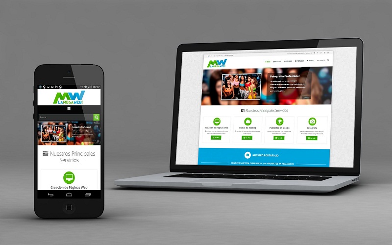
The adaptive design consists of making a web that can be displayed correctly on all devices: pc, smartphone, tablets , making the visit of your user as comfortable as possible. Fortunately we design web pages that adapt to all mobile devices , tranquil if you do not want to do it yourself, we will do it happy!
WHAT IS ADAPTIVE DESIGN OR RESPONSIVE?

Of course, if something has the ‘responsive’ design is that, without translating it sounds horrible. Surely if you hear ‘adaptive’ design. And that, being adaptable is optimized so that the user experience is optimal from any device : computer, Tablet, Smartphone … we would understand each other more.
Basically, and as the name suggests, the web page is ordered and adjusted in a different way for each device. So that, for example, on a mobile the texts and buttons are larger to facilitate readability or usability .
If you still have doubts, we show you a graphic so you can see it clearly:
So, if web designers had ‘complicated’ and the task of carrying out a design that was compatible with different browsers. Such as Firefox, Chrome, Safari and even the damn Internet Explorer (which is well buried, fortunately) added to that game design an adaptable website that is usable and entertaining on all devices : let’s triple the effort! It’s really worth it, have you asked yourself how much traffic your website gets through mobile devices? There is a target of users who do not know how to operate a computer, but instead, they perform perfectly well with a mobile or tablet.
REASONS FOR MAKING A WEB WITH ADAPTIVE DESIGN

VISITS FROM SMARTPHONE 67%
- Households access the internet in mobility (smart phone)
THEY ARE PIRAN 80%
- … if the experience is not comfortable, you will lose users; customers.
- We love statistics, in addition, they are very cute in the post.
But no, it does not end there, in 2014 more than 21.4 million Spaniards have accessed the Internet in mobility.
Responsive is, why not; a way of thinking: adapt or die , as drastic as that, the Internet connection in mobility increases. And does not stop doing it: make your website adaptable and improve the user experience!
WEB OPTIMIZED FOR MOBILE AND TABLET
We do not want to be bold, or yes, what the fuck: if we do not separate from the phone or go to the bathroom! Years ago, we read the composition of the soap. Analyzed the texture of the toilet paper, or criticized the lighting in the room, but today. We buy or look at our social networks! It is essential to offer content for mobile phones and tablets. You never know how, when or where you are going to visit.
The Spaniards, we passed. In the best of cases; an average of 5h looking at the screen of our mobile is not enough reason to make your web with adaptive design?
GOOGLE PENALIZES WEBSITES THAT DO NOT ADAPT

The new algorithm of Google, implemented on April 21; penalizes the positioning of websites that are not adaptable or optimized for mobile .
There has been much debate about this, even claiming that it is a mass extermination by the Internet king. The penalty will only apply to mobile searches it makes sense: if you can not see correctly on a mobile Google does not show it. Users who search from computers or tablets will not suffer any change. It should be noted that in a few years half of the world’s population is expected to have an Internet connection and access the internet through smart phones.
I WANT TO KNOW IF MY WEBSITE IS OPTIMIZED

So, as we say, adaptive design is the only way of web development with a future. After a few years half of the world’s population (it is said soon) will surf the Internet with their smart phones. And your website must be adapted with a correct readability and optimal usability.


